How to Coordinate Interior Door Colors With Flooring

Time:2026-10-08 Author:Charlotte
0%

Choosing interior door colors should feel intentional, not forced. The right combination can connect separate rooms, soften strong flooring, and make a narrow hallway feel wider. Yet many homeowners begin with paint samples alone. That approach often fails. Flooring reflects light differently throughout the day, while doors create vertical color blocks at eye level.

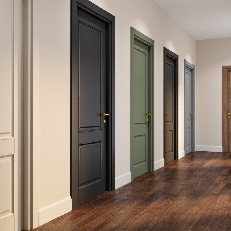
Learning how to coordinate interior door colors with flooring starts with observing both materials together. Place a door-color sample beside the actual floor, not a website image. Notice the undertones. Warm oak flooring may clash with a blue-gray door, even when both colors look attractive separately. Dark walnut floors can support cream, charcoal, muted green, or natural wood doors. Pale timber usually benefits from warmer whites and gentle taupes.

Interior designer Kelly Wearstler has said, “Color is everything.” Her statement feels especially relevant here. Color is not decoration added at the end. It shapes the room’s mood, rhythm, and visual balance. Still, there is no perfect formula. I have seen matching doors and floors create a flat, heavy effect. I have also seen contrast become too sharp around small rooms. That is worth remembering.

Consider the trim, wall color, hardware, and natural light before deciding. Test samples during morning and evening hours. Live with them briefly. A slightly imperfect choice may reveal more character than a carefully matched scheme. This guide explains practical combinations, common mistakes, and flexible ways to create cohesion without making every room look identical.
How to Coordinate Interior Door Colors With Flooring

Define the Relationship Between Door Color and Floor Tone

How to Coordinate Interior Door Colors With Flooring

Define the Relationship Between Door Color and Floor Tone

Interior doors and floors should relate, not match exactly. Their relationship depends on undertone, contrast, and the amount of light in the room. A warm oak floor usually works with cream, beige, or muted green doors. A cool gray floor may suit soft white, charcoal, or blue-gray doors. The goal is visual balance, not a perfect color copy.

Start with undertones.

Place door and flooring samples beside each other before making a decision. Natural light can reveal yellow, red, or blue undertones that showroom lighting hides. Check the samples in the morning and evening. Dark doors can make a narrow hallway feel smaller, especially beside deep flooring. Pale doors create more openness but may look weak against rich wood tones. Door trim can either connect the colors or sharpen their contrast.

A practical choice also considers how the space is used. In busy homes, medium-value doors often hide fingerprints better than very pale finishes. Satin or low-sheen surfaces can soften strong color differences. This rule can fail, though. Very similar door and floor colors may blur the room’s structure. I would rather choose a deliberate contrast than create an accidental near-match. Small mistakes matter. A sample test is worth the extra day.

Compare Warm, Cool, Neutral, and Contrasting Color Combinations

How to Coordinate Interior Door Colors With Flooring

Warm floors, such as honey oak or terracotta tile, pair naturally with cream, tan, and muted brown doors. These combinations create a welcoming feeling, especially in living rooms and hallways. I usually compare samples in daylight because warm bulbs can distort the color. A door that looks balanced at noon may appear orange at night.

Cool flooring, including gray stone or pale ash wood, works well with soft white, blue-gray, and charcoal doors. Keep the undertones consistent. A cool gray floor beside a yellow-based white door can look slightly dirty. I have made this mistake in a renovation, trusting a small sample too quickly. Larger samples reveal these conflicts.

Neutral floors offer more freedom. Beige, greige, and natural light wood can support warm or cool doors, depending on the room’s furniture and wall color. Contrasting combinations can add character: a deep green door against pale flooring feels intentional, while a black door creates sharper definition. Use contrast carefully near narrow hallways, where dark doors may feel heavier. Test the color beside trim, flooring, and nearby walls before choosing. Four surfaces matter.

Match Door Finishes With Flooring Materials and Surface Textures

Interior doors should relate to the floor without copying it exactly. A close match can make both surfaces look flat. Instead, compare the door finish with the flooring material, grain, and texture. A smooth painted door works well with textured wood flooring because it creates gentle contrast. A naturally grained door may suit polished stone, where its warmth softens the cooler surface.

Look at the flooring under daylight and evening lighting. Warm oak tones can make a pale door appear yellow. Gray flooring may expose pink or orange undertones in certain wood finishes. Place a door sample beside the floor, not across the room. Check it near the baseboard, where color differences become more noticeable. Texture matters too. A matte door usually feels balanced beside brushed timber or honed tile. Glossy finishes can compete with reflective flooring.

I once chose a finish that looked perfect in a showroom. It felt too dark at home. That mistake taught me to test samples for several days. Small scratches and fingerprints also change the practical choice. On a busy hallway door, a soft matte surface often hides marks better than high gloss. Still, there is no single correct pairing. A slightly different tone can add depth, while an identical finish may feel overly planned. Compare the samples from standing height. Then open and close the door repeatedly. The movement changes how its finish interacts with the floor.

How to Coordinate Interior Door Colors With Flooring: Match Door Finishes With Flooring Materials and Surface Textures
Flooring Material Typical Surface Texture Recommended Door Color or Finish Undertone to Coordinate Visual Relationship Sheen Guidance Practical Design Note
Light oak flooring Fine grain, wire-brushed, or lightly textured Warm white, soft greige, natural oak, or muted taupe Warm beige, honey, or neutral undertones Use a door that is slightly lighter, darker, or less patterned than the floor to create definition. Low to satin sheen Natural or painted doors help preserve the bright, open appearance commonly associated with light wood floors.
Medium-toned oak flooring Moderate grain with smooth, brushed, or hand-scraped texture Warm greige, mushroom, medium wood stain, or creamy off-white Balanced warm or neutral undertones Coordinate the undertone rather than trying to match the exact wood color. Satin or semi-gloss for painted doors Repeating one subtle wood tone elsewhere in the room can make a contrasting door feel intentional.
Dark walnut-toned flooring Smooth or medium-grain surface with noticeable depth Warm white, light greige, charcoal, or a closely related dark wood finish Warm brown, neutral gray, or carefully balanced charcoal Light doors create contrast; dark doors produce a more enveloping and formal effect. Low-sheen for stained wood; satin for painted surfaces Very glossy doors can emphasize surface imperfections and compete with the richness of dark flooring.
Gray-toned wood flooring Wire-brushed, weathered, or linear grain Cool white, pale gray, blue-gray, or neutral greige Cool gray or true neutral undertones Keep both finishes within a similar temperature range to avoid a visibly mismatched blue-versus-yellow effect. Matte or satin Warm beige doors may look disconnected unless warm furnishings or trim are used to bridge the palette.
Bamboo flooring Fine linear grain; strand-woven surfaces may appear more varied Natural wood, soft white, light tan, or muted green-gray Natural golden, neutral, or gently earthy undertones Simple door finishes complement the distinctive linear pattern without adding visual clutter. Satin or low-sheen Choose a door texture that is calmer than the floor if the bamboo has strong directional patterning.
Cork flooring Soft, cellular, speckled, and naturally irregular Warm white, sand, clay, light oak, or muted olive-gray Warm natural, earthy, or neutral undertones Organic door colors reinforce the floor's natural softness and reduce visual contrast. Matte or eggshell High-gloss finishes may look overly formal beside cork's soft, tactile surface.
Concrete flooring Smooth, polished, honed, or visibly mottled White, charcoal, black, light oak, or medium natural wood Neutral gray, cool gray, or balanced natural wood Wood doors add warmth, while gray or black doors strengthen a minimalist architectural scheme. Matte, satin, or polished only when carefully controlled Use texture contrast deliberately: a natural wood door can soften a hard, smooth concrete floor.
Ceramic or porcelain tile Stone-look, wood-look, polished, matte, or lightly textured Match the tile's dominant undertone with white, greige, taupe, or a related wood tone Determine whether the tile reads warm, cool, or neutral in natural light. For patterned tile, a visually quiet door usually creates the most balanced composition. Satin or semi-gloss for easy cleaning Tile with a strong pattern generally pairs better with a plain door than with a heavily grained wood finish.
Natural stone flooring Varied veining, cleft texture, honed, or tumbled surface Warm white, stone gray, taupe, or a restrained wood stain Repeat one of the stone's visible undertones rather than its entire color range. Quiet doors allow natural variation in the stone to remain the focal point. Matte, eggshell, or satin Take a physical stone sample when selecting the door color because natural stone can shift noticeably under different lighting.
Luxury vinyl plank Wood-look grain, embossed texture, or smooth printed surface Coordinate with the plank's dominant wood tone, or use neutral painted doors Follow the plank's main beige, brown, gray, or neutral undertone. Exact matching is not required; a related value and undertone usually look more natural than a near-match. Satin or low-sheen Because plank patterns repeat, a solid-color door can provide useful visual relief in open-plan spaces.
Laminate flooring Wood-look, stone-look, embossed, or smooth surface Soft white, greige, taupe, or a stain that relates to the floor's main tone Match the dominant undertone visible across several planks. Use contrast in value or texture when the floor and door would otherwise look like an artificial exact match. Satin or semi-gloss Bring a flooring sample to the paint or finish selection area to compare colors under the same lighting.
Carpet flooring Soft, looped, cut-pile, patterned, or subtly flecked Coordinate with the carpet's undertone using painted white, greige, taupe, or natural wood Warm, cool, or neutral undertones in the carpet fibers Since carpet has a soft visual texture, a smooth door finish often provides a clean and balanced transition. Satin or semi-gloss for durability For patterned carpet, select a door color from the pattern's least dominant shade to avoid competing motifs.
Terrazzo flooring Polished or honed surface with visible aggregate chips Use a quiet neutral or repeat one subtle aggregate color Choose from the terrazzo's background tone or a restrained chip color. Simple doors keep the multi-color floor from appearing visually crowded. Satin or low-sheen A door color that matches a minor terrazzo accent can create cohesion without making the room look overly coordinated.

Coordinate Trim, Walls, and Hardware With the Chosen Door Color

Coordinate interior doors with the floor, but do not stop there. Trim, walls, and hardware must support the same visual temperature. The 2024 National Kitchen & Bath Association Design Trends Report highlights warm neutrals, natural textures, and wood-inspired finishes in residential interiors. That direction favors oak, walnut, greige, and soft white doors. Choose one dominant undertone. A reddish floor beside a blue-gray wall can look accidental, even when every color is attractive alone.

Start with the largest fixed surface, usually the flooring. Then compare door samples in daylight and evening light. The Illuminating Engineering Society notes that color appearance changes with light source and color temperature. Use this evidence practically: test a 60-centimeter sample beside the floor, baseboard, and wall. Trim can match the door for a quiet, continuous frame. Alternatively, match trim to the wall, making the door feel more like furniture. Avoid mixing bright white trim with a creamy door. The contrast is often sharper than expected.

Hardware should repeat a finish already present in the room, such as a dark faucet or aged metal light fixture. The 2024 Houzz & Home Study continues to show strong homeowner investment in personalized interior updates, but personalization needs restraint. I have seen attractive rooms fail because every element became a separate statement. Keep one focal contrast. Perhaps the door is deep green, while the walls remain muted and the floor stays natural. Reconsider the plan after installation; paint chips rarely reveal how shadows gather around a real door.

How to Coordinate Interior Door Colors With Flooring

Approximate Light Reflectance Value (LRV) comparison for coordinating doors, trim, walls, and flooring.

LRV measures how much visible light a surface reflects on a scale from 0 (black) to 100 (white). Pairing finishes with a gradual LRV transition usually creates a balanced interior: use lighter doors and trim with dark flooring, moderate contrast with medium flooring, and warm white or soft-gray walls to connect the palette. Coordinate hardware in matte black, brushed metal, or aged bronze according to the temperature and contrast of the selected door color.

Test Color Samples Under Different Lighting Conditions

When coordinating interior door colors with flooring, test samples under real lighting, not showroom lamps. I learned this after a warm gray door looked green beside oak flooring at home. Light changes perception. The CIE 015:2018 colorimetry report lists Standard Illuminant A at approximately 2856 K and daylight D65 at approximately 6504 K. These conditions can make one paint appear warmer, cooler, or less saturated. A sample can deceive you.

Use door and flooring samples together. Place them near a window, beneath ceiling lights, and beside a shaded wall. The U.S. Department of Energy’s 2023 Solid-State Lighting R&D Opportunities report treats color quality and controllability as major lighting considerations.

For residential comparisons, lamps around 2700–3000 K usually reveal warmer undertones, while 3500–4000 K can emphasize gray or blue notes. Choose lighting with CRI 90 or higher when possible. CRI is useful, but imperfect.

Try three sample boards, each at least 30 centimeters wide. Keep them in the room for a full day. Check them in the morning, afternoon, and evening. Turn overhead lights on and off. Watch how beige flooring reflects onto the lower door edge. I would also photograph the samples, though phone cameras often correct colors automatically. Written notes may be more honest. Record what clashes, not only what looks attractive.

FAQS

How should I begin coordinating a door color with the room?

Start with the largest fixed surface, usually the floor. Identify its main undertone, such as red, yellow, gray, or brown. Choose a door color that supports it. Do not judge the door alone.

Should the trim match the door or the wall?

Matching the trim to the door creates a quiet, continuous frame. Matching it to the wall makes the door resemble furniture. Both options can work. Bright white trim beside a creamy door may look unexpectedly harsh.

How large should my color samples be?

Use one sample at least 60 centimeters wide for floor comparisons. Three boards around 30 centimeters wide can show different finishes. Place them beside the floor, trim, and wall. Small chips can mislead you.

Why should I test colors in different lighting?

Light changes how warm, cool, or saturated a color appears. Check samples near a window and beneath ceiling lights. Compare them in the morning, afternoon, and evening. One paint can look gray at noon and green at night.

What light temperatures are useful for testing?

Warm lamps around 2700–3000 K reveal yellow and beige undertones. Cooler lamps around 3500–4000 K can emphasize blue or gray notes. Daylight also changes during the day. Lighting tests are helpful, not perfect.

How can I coordinate door hardware with the room?

Repeat a finish already used nearby, such as a dark faucet or aged metal light fixture. Avoid giving every object a different finish. One clear contrast usually feels calmer. Too many statements compete.

Can a bold door color work with natural flooring?

Yes, if the walls remain relatively muted. A deep green door can sit comfortably beside natural wood flooring. Keep the surrounding colors quieter. The plan may look different after installation.

What details should I record during color testing?

Write down what clashes, not only what looks attractive. Note shadows around the door and reflections along its lower edge. Take photographs, but treat them cautiously. Phone cameras often correct colors automatically.

Conclusion

Learning how to coordinate interior door colors with flooring starts with understanding how their tones interact. Warm floors, such as those with honey, oak, or reddish undertones, often pair well with warm door colors, while cool floors can be balanced with gray, blue, or muted green shades. Neutral doors offer flexibility, and contrasting colors can create a stronger visual statement when used thoughtfully. The amount of contrast should also suit the room’s size, style, and natural light.

The relationship between color and texture is equally important. A smooth painted door may complement polished flooring, while a textured or wood-finished door can enhance floors with visible grain. Trim, walls, and hardware should support the chosen palette rather than compete with it. Before making a final decision, place door and flooring samples together and observe them in morning, afternoon, and evening light. This simple test helps reveal undertones and ensures the combination remains cohesive throughout the day.

Charlotte

Charlotte

Charlotte is a seasoned marketing professional with a deep understanding of the company's portfolio and a passion for elevating its presence in the market. With a keen eye for detail and a commitment to excellence, she ensures that our professional blog is regularly updated with insightful articles......